
Due to the nature of this project and associated clients, I cannot share the entire design process for this project. While I'll only be showing high-level context and key artifacts, extensive research, prototyping, iteration, and collaboration were behind every step.
Committed to innovation, Wells Fargo wants to meet evolving consumer needs and shopping experiences by transforming the mobile credit card application process to set a new standard of digital banking.
The Problem
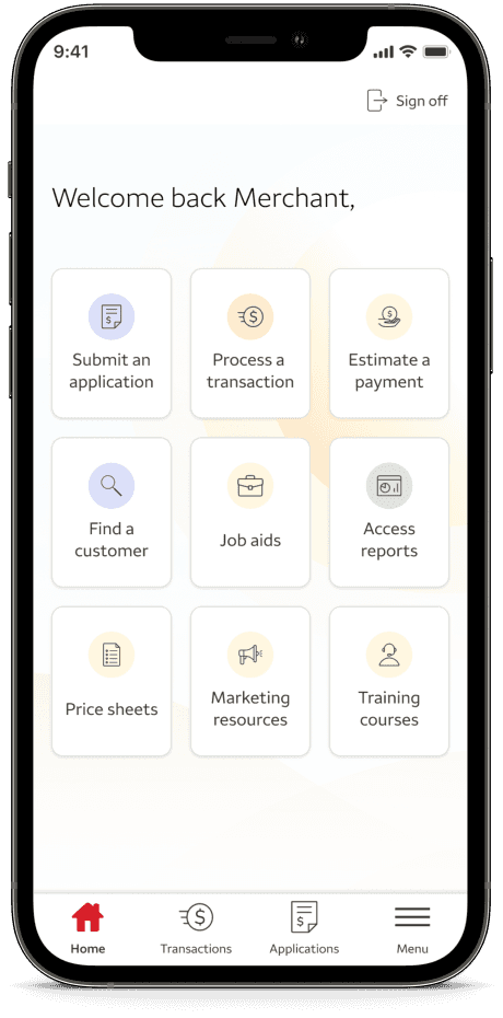
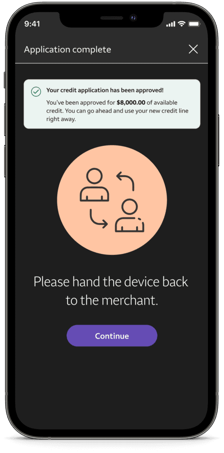
While there was a mobile application - it was a copy-and-paste of the web version and built solely on stakeholder requirements and assumptions from the personal lending team. Wells Fargo merchants and prospective private label credit card (PLCC) customers struggled to navigate the outdated and disjointed application experience - leading to low customer retention and operational efficiency rates.
The Goal
Our team aimed to enhance the mobile credit card application by creating tailored flows for organic and merchant-based customers, developing a customizable system to meet merchant-specific needs, and boosting customer retention and completion rates by streamlining the process to reduce time-to-task and errors.
We created a unified application and transition experience to enhance efficiency and increase customer retention, ensuring consistency across all versions. By simplifying and streamlining the user flow, creating a clear interface that reduces cognitive load, and implementing standard processes, we can provide a seamless and reliable experience.
Our team quickly realized there was a significant lack of understanding of our user base and the current state of the product. To create alignment within the team, we lead our stakeholders through product discovery sessions.
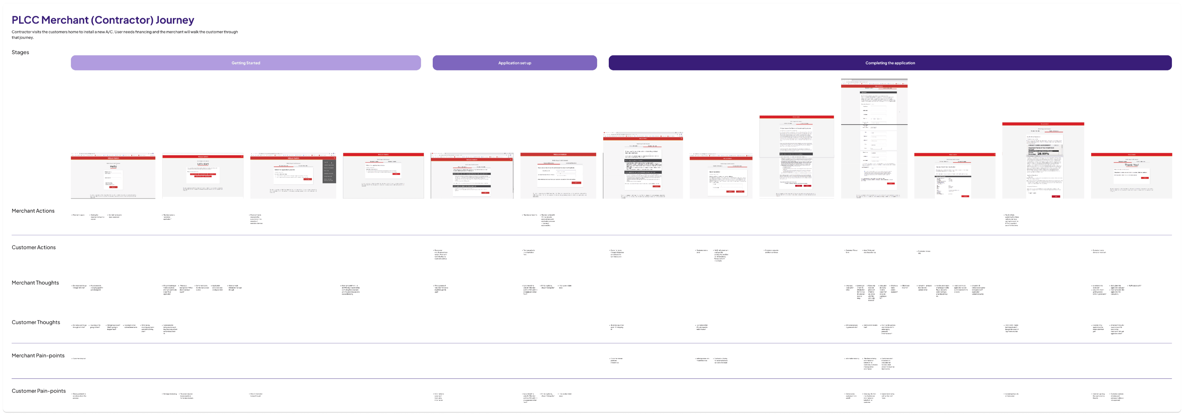
One activity that resonated with the team was laying out the customer journey. By breaking down merchants' experience screen-by-screen and exploring the customers' experience to identify wins and opportunity areas, our work began to have a sense of impact in the team's mind.
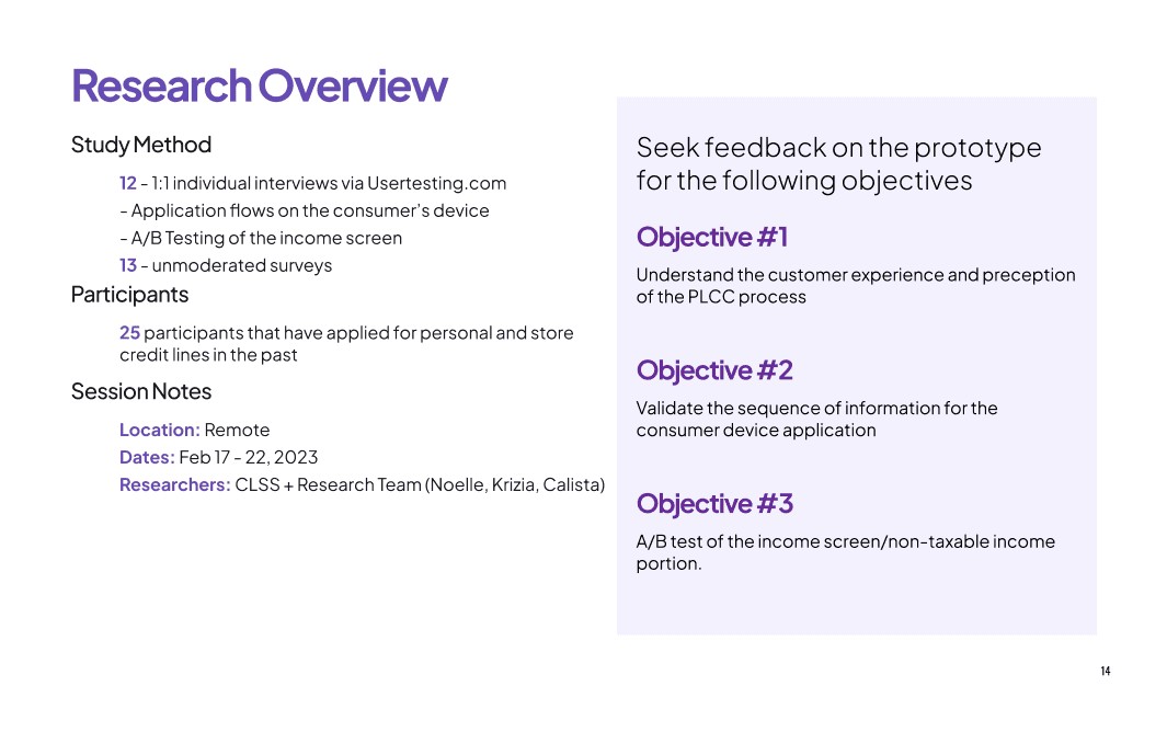
7 interviews were conducted - 3 merchants and 4 customers. I took point in interviewing the customers and synthesizing the data from both groups (with the guidance of my senior designers)
Key findings:
Overall
Users and merchants alike felt frustrated by the excessive amount of required fields, the overload of information on one screen and how many times information had to be entered.
Merchants
Merchants expressed that the process hasn't kept up with shopping trends and customer expectations, like quick approvals and application/transaction integration.
Customers
Customers felt insecure during the application process because errors were not communicated clearly, assistance was limited, and the language used was too technical.
I analyzed the Discover and Citi Bank apps to note their strengths, and weaknesses and identify trends in the market. Presenting these findings to the team helped direct where to take our design.
Personalization was seen throughout the experience
Using progress bars and description page headers to orient users.
Using cards to divide and group content
Aligning ourselves with goals for this redesign was crucial for this project's success because it ensured that the design was user-centered and addressed real needs rather than baseless assumptions. This time also helped establish trust between non-design team members, making collaboration and incorporating insights later in the project easier.
Below are a few project goals:
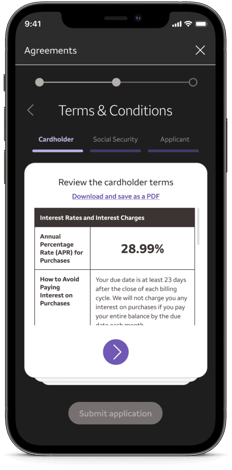
Clearly explain terms, conditions, and next steps in a way that makes users feel informed and secure.
Smoothly include the application process into a transaction in a way that promotes financing as an option.
Ensure that the application process meets new regulation requirements and reduces risks for consumers and businesses.
To enhance efficiency and customer retention, we will create a unified and modernized application and transaction experience for WF merchants and prospective private label credit card customers, ensuring consistency across all versions.
Our team quickly realized there was a significant lack of understanding of our user base and the current state of the product. To create alignment within the team, we lead our stakeholders through product discovery sessions.
I'll admit that coming onto this project was never-wracking, it felt like being pushed into the deep end of a pool. But as nerve-wracking as it was, it was also refreshing to hit the ground running and be exposed to so many different processes from the get-go
Below are a few of my thoughts on the project:
Relationships can do more for your work than you can. As I was new to the team, I owe my credibility to my senior designers. However, as I led activities, presented findings, and came into my voice - I felt my options and expertise had it's own weight.
Iterate fast and test often. I lost count of how many iterations a screen or an aspect of a feature we ran through during this project (our Figma file was a bit of a mess at times ^^;). While tedious at times, going through so many options helped build confidence in the direction of our design.